Pages

Latest Tweet:

    follow me on Twitter

    Monday, June 15, 2009

    Bad Microsoft Design...

    I speak with regards to Windows Live Messenger, a free download is available to all windows users. No doubt every single person who reads this blog will know of this program, and will have probably used it at some point in their life!

    Well as some of you may know, I decided to reformat my PC and install Windows 7 RC to see what improvements had been made since vista (there are many!) but more on that in a later blog post. Anyway, as part of my testing / daily computer tasks I will be using WLM. So i downloaded the web installer and set to work, installation went like a dream so no problems there. The problems start when I run WLM for the first time, I was presented with this...


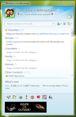
    Yes, thats right, out of around 200 of my contacts I can see only 1 person. This is just completely stupid. Fair enough, Microsoft may have a new idea about how we should all organise our contacts, into groups and favourites and whatnot but seriously, the implementation couldn't have been worse. After about 5 minutes of tinkering I was able to make it look like this...


    Now I don't know about the rest of you, but this is certainly what I would prefer to see immediatly after instalation. Maybe have a tutorial popup which helps users migrate their contacts to the new group and favourite system? Wouldn't that make more sense? I guess not, afterall what would a 19yr old fresher know about design...

    Comments (6)

    Loading... Logging you in...
    • Logged in as
    You're just starting to complain about Messenger now?! You're about 5 years late on that one lol.

    I think most people who know what theyre doing use groups anyway, all MS have done is to make the better way of viewing contacts the default. When you have a large number of contacts, showing everyone whos online just doesn't cut it. I like to have 3 groups so that i can prioritise people and hide the less important people. Besides, it isnt hard to disable it, and it isnt hard to drag contacts across.

    This is a non issue, they have taken a feature that works well, and put it to the forefront.

    And I have to say: What WOULD a 19 yr old fresher know about design? You're complaining a non issue, when there are so many other things you could be complaining about related to this piece of software.
    Point taken, however. I am just starting to complain about Messenger now because I have just gone back to windows from a mac, so haven't used WLM for a while!

    Your point about it being a feature that works well is not one that i contend, if you read closely, its the implementation of it that I think is truely awful. They have just presented the user with this new organisation system and no explanation of why, or how to use it!

    All i'm saying, is that the feature (whilst worthwhile) was introduced in possibly the worst ever way! Maybe you or I would look at it and know where to delve into the options to turn it off, or bother to assign contacts to groups. But your average PC / WLM user, would not bother!

    So aparently i know nothing about design, well maybe not, but i know what irritates me when it comes to shoddy implementation of a new design! Personally I think they've made the messenger program needlessly complicated and thats why i prefer open source alternatives!
    Well defended! I agree with you, theres really not much left to say is there!
    Sam my friend, it is true, most users will not want to tweak and play about, but when you install something new, you do have to look at the settings. Macs are all about relying on the steve to have made the decisions for you, while MS is all about setting what they think most users will want, and then allowing them to change and edit stuff.
    I'm sure when i installed it, it came up with a "what's new" window, explaining stuff. Maybe you just closed it automatically. Course you wouldn't see it if you uninstalled and reinstalled again because it assumes you have already read it.
    BTW, this is the sort of post you could put on techrant. Going to re launch it with a new theme in the next month or so. Moving host today.
    Maybe because you're skipped a few generations, you have missed the jump to a grouped system - and the trasition was made in an earlier update. Tbh I dont think a drag and drop interface is counterintuitive, and I did think there was a "whats new" popup box that came with messenger. Now can we move onto why it never works and has such a bloated UI? lol
    Hmm, good point about skipping several generations. And it may have been some strange bug that I did not get a what's new popup window, maybe something to do with Windows 7.

    And Ben, i take your point, but I guess the reason I own a mac is because i dont want to have to look at the settings after installing something. I am happy to use it as 'the Steve' would have wanted, but am happy knowing that the tweaks are there for me to apply as and when I wish. Because lets face it Apple normally make the right decisions!

    Lol, and yep Adam, personally i think Microsoft went down the wrong track when they introduced Winks, Nudges and Voice clips! As for the bloated UI, i guess that was what prompted me to write the origional blog post! Mess.be offers a good plugin for advanced tweaking, i'm sure you're aware of it!

    Post a new comment

    Comments by